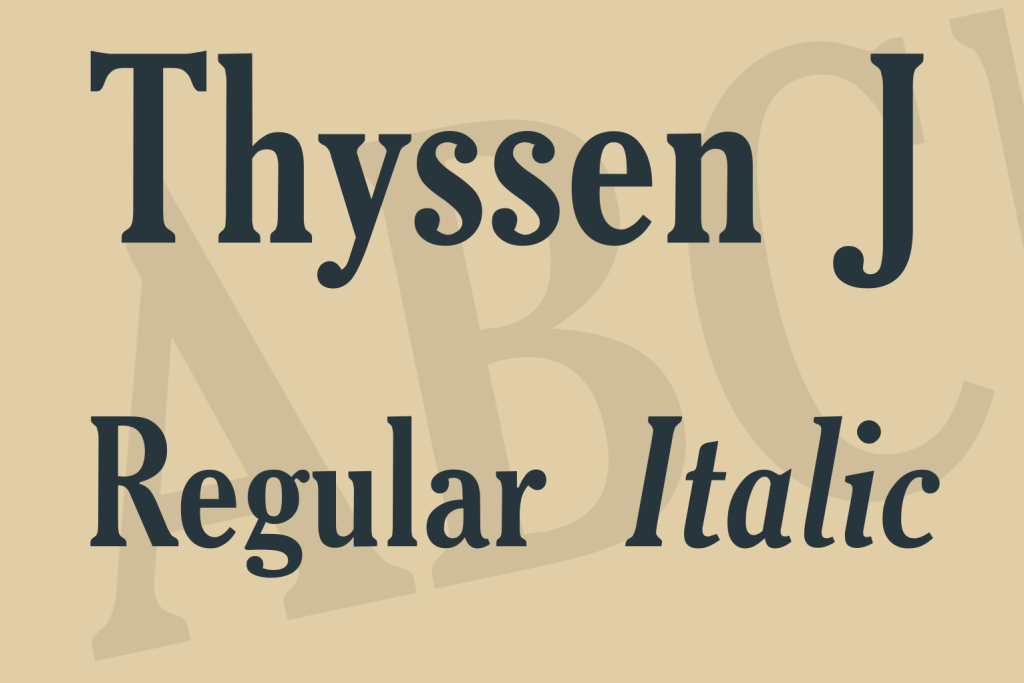
About 9juliust.ttf is designed and produced entirely from scratch by me, Julius.
It’s one of my handwriting-derived fonts, I created it for personal use.
This “Julius B Thyssen” TrueType is rather lightweight, but so should
any scanned Parker-blue ballpoint-written material be, I think.
When you use it for bulk, you’ll get very nice-looking results printing
it at 14-16 points size, with line/paragraph height set around 17 points.
I’ve also used it quite often for large headers with a shade or dropshadow.
Looks nice with this font.
First version came about in 1993 by use of a scanner, Photoshop,
Freehand, Coreltrace, Old Fontographer and Fontmonster. Yes, 1993,
and it was a hell of a job! Soon after I had printed some letters
using this font, people started telling me things like:
“Wow man, is that your handwriting? Can I have it too? It’s beautiful!”
I decided to give it a try and put one of the early versions of this
font out on a CD-ROM that I was publishing for a Sybex-computer-book
in the Netherlands. The file you have gotten with this text however,
is a later and improved version, and I very much like older versions
to be replaced by this one, so I released it for internet-distribution.
This 6th version of 9juliust.ttf was generated September 1998.
A driving force behind this update has been Jolanda de Putter, a very
sexy girl I fell in love with back then. Pity it wasn’t all mutual..
Jolanda was crazy about my letters though, printed using this font !
I’m still not entirely sure about some details. The “e” for example
used to be a little small, now it seems too large again.
You can always check for new versions. (Please do!) This font and some
others I’ve made can be obtained through a download-page on the http://jthz.comthz.com will take you there.

