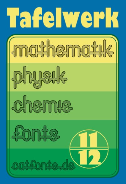
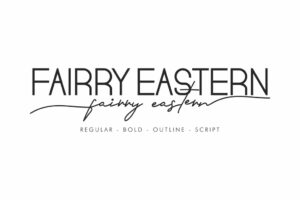
About Translated from original German description: As always, I’m regularly on the go in the Typografi.info forum. And then there was the question from a forum member who had found a worn-out edition of a GDR textbook in the basement. A table for 11th and 12th graders of the POS, published by Verlag Volk und Wissen, in an edition from 1988. The question was which fonts were used for the cover design. The questioner had already recognized the Gill Sans himself, but this multiline font seemed to be a tough one this time. The forum font recognition cracks didn’t have a plan either.
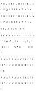
That appealed to me, and I wanted to show that even a typeface that looks quite complicated can be built very quickly if you know how to use vector graphics. So I quickly had the letters together to adjust the book title (see here to the left of the text). So I completed the font with numbers, sentences and special characters, and let everyone participate in the progress.
Days later, however, the forum operator had solved the riddle of the font: In 1969, Christine Lord first published it under the name “Lord Lower Case Linked” and later renamed it Oxford, which was then used in Face Photosetting as a photoset font (as well as they Stack) and later when Letraset rubbing sheets came out.
But since I was already quite far with my version, in many details a new interpretation of my own, I wanted to make my thing out of it. So I added my Cyrillic letters, more print-oriented than V. Kharyk’s more script-style Cyrillic version, and most recently an OpenType automatic, which automatically connects words, and allows text with and without the first and last dashes . This is how the
Tafelwerk OT came about.

