About The MalaTesta fonts are based on a writing sample, titled “Lettere piacevolle”, and dating from the 16th century. I copied it out of a book from the library, years ago, but forgot to include the caption, and kept no notes concerning the source. After turning it into a font, I had to search the Net for information … and I found it! Doing a search for that queer title led me to a Google book, by Lewis F. Day, on Penmanship of the 16th, 17th, and 18th century, which is displaying my writing sample (among lots of others), and stating that it was taken from A booke containing divers sortes of hands, published by J. de Beauchesne and J. Baildon, in 1571. Apparently, Beauchesne/Baildon didn’t name the writing master who created this “rather fantastic italic hand” — quoting Lewis F. Day’s judgment here; and I don’t think he meant it in an altogether favorable way.
(BTW, that precious Google book, which is downloadable as a free PDF, even contains two samples of Francisco Lucas’ penmanship — though not those my font is based on, and certainly not the best he ever created.)
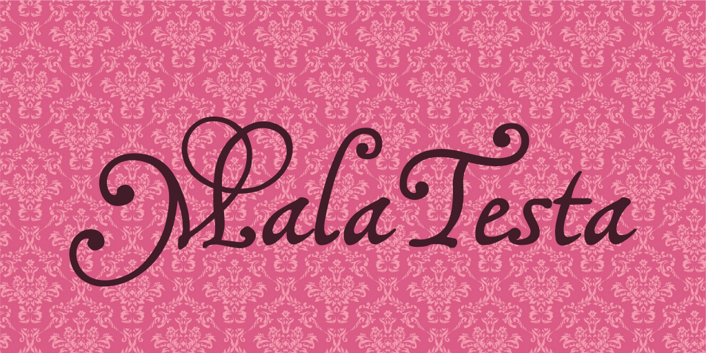
This is essentially one font that comes in two weights. I called them MalaTestaCK and MalaTestaN, because ck and n are the consonants that distinguish the words ‘thick’ and ‘thin’. However, it is likely this denomination will not last. By next update, both fonts may be assembled into one family. As to the name MalaTesta, I sincerely hope you’ll never find out why I think it’s self-explaining…
… for, sorry to say, these fonts can get quite messy. All of those curls, and hooks, and swashes, which may produce rather pretty effects in the right places, will get horribly entangled in the wrong ones. I did a lot of kerning, but, I fear, not nearly enough, and then there are still some odd combinations of characters, where all the kerning in the world will not help. So, the use of alternate characters, in these fonts, should not be avoided. They have been designed, not to make the font look more elaborate, but to simplify things. Let me implore you to at least use the bar or broken bar sign, whenever you want to type a Th in one of these fonts.
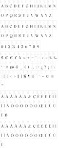
On the number sign of the MalaTesta fonts, you’ll find a long s, as usual. The other irregular characters are
an alternate g on the ‘plus’ sign
a double g on the ‘equal’ sign
an alternate y on the ‘less’ sign
an alternate p on the ‘more’ sign
a Th on the ‘bar’ and ‘broken bar’ sign, which you are strongly recommended to use, since no amount of kerning can make the regular T
a simple l, without the top curl, on the left bracket, which you are strongly recommended to use, too, whenever an l is followed by another l, or a b, f, h, or k … it will look a lot less messy!
an alternate d on the right bracket
a double f on the left curly bracket
a double p on the right curly bracket
a curly ending e on the ‘degree’ sign
a little swash on the ASCII circumflex sign, that is best used to make a t preceded by an s, c, e etc look like a ligature. It has to be typed like an accent, before the t.
a bigger swash on the ASCII tilde sign, to be used wherever it fits
a double long s on the long s sign
and, just in case, if you really need a ‘plus’ sign with this font, you’ll find it on the ‘plus/minus’ sign.
Ah, yes, the images on the micro sign are wholly unconnected to the fonts, and were designed after some rather funny initials from a medieval codex. Believe it or not, they are meant to be an M and a T.