Hello Uplabs! 😷
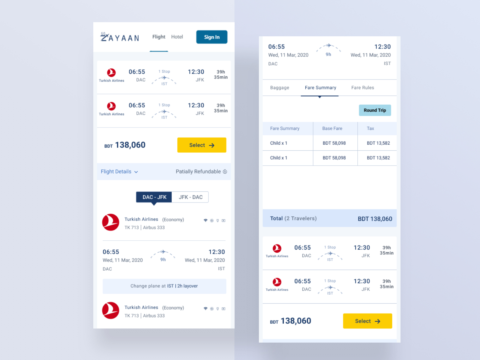
Here is my new design concept of the Go Zayaan search for any flights.
Go Zayaan: “As you know we are working on our platform since the beginning so the core focus is always it’s design and pattern. If we can bring something innovative then it would be the more wow factor for us. That’s why this task is a mixture of UI and UX both.We have attached an element of our current design as a sample. When someone search for any flights for any specific destination he/she will be able to see a list of available flights for that destination. This attached element is the single item of that list. Initially we show it in a collapsable cell then user can expand and see the flight details. Airline, timing, Origin, Destination, Stoppage, layover time, almost all the highlighted data are visible there.You have to think about how we should represent this to user, how it would be more user friendly and plan it on a mobile view. It doesn’t need to be fancy, high contextual just maintain the minimal theme and your creative idea. You can send a sample design with your thought process or a mockup with your idea both will do. If you still have any confusion regarding this please reach us before experimenting.”
I am trying to more user-friendly design. some point of the issue I solved it.1. Flight Details Some Add & Changes.2. Fare Summary UI Some Changes.3. Select Button And this Section Some UI Changes.4. Flight Stoppage Some Changes.5. Partially Refundable icon added.
Hope you like it! Press “L” on your keyboard if you do and follow me to not miss upcoming work.Take Care & Love from Imran Molla!************
Have a beautiful and caffeinated ☕️ day!
___
🔥Check My latest Blog:https://medium.com/@Imran_Molla/top-10-fonts-for-modern-ui-c9e4e526f8cc
I’ll be happy for any feedback.Hope you like it!🔥************Don’t forget to add ❤️ and Follow me************
===============================================I am available for freelance work. Contact me through my email and Skype.Email: [email protected] Skypee: imranmolladu
Share some love by pressing ‘U’ if you like this shot 🙂
Follow us on Behance | Instagram | Dribbble
Thanks a lot for watching!

