Geo Font Family

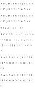
About I was shown squared-off lettering on a record label and asked to draw something similar. Geo, the result, was substantially completed within four hours in July 1999. It?s a simple geometric typeface in the mould of some of the experimental faces designed during the 1920s by well-known modernist designers such as Theo van Doesberg and Herbert Bayer.

This style found a strong echo in designs of Neville Brody in the 1980s, which are now identified as an expression of the consumer culture of that decade. During the 1990s the magazine and font catalogue Emigre was at the public front of typeface design, and was a place where computer fonts with this same look appeared.

I think Geo expresses both the directness of some of the 1920s faces and the rather disingenuous consumerist thrust of the 1980s and 1990s descendants of theirs.

Download now to enhance your projects with visually stunning and user-friendly designs. With FigmaResource.com, you can save time, boost your productivity, and achieve professional-grade results without breaking the bank. Start exploring our vast collection today and take your design projects to the next level!

Discover an extensive library of free, high-quality design assets at FigmaResource.com, your go-to destination for all things Figma. Whether you’re a professional designer or just starting out, our platform offers a wide range of resources, including UI kits, icons, templates, and more, all meticulously crafted to help you streamline your design workflow.

At FigmaResource.com, we understand the importance of having the right tools at your fingertips, which is why we provide these assets completely free of charge. 

Please be aware that while you can download free resources from our website, we do not host any of the files directly. All resources are handpicked and collected from various external sources.