About This is the Cadman font.
I have two friends who are dyslexic and they both expressed the need for a clear and legible font so I made one.
The name of the font is an indirect reference to one of these people who spends a lot of his time using CAD systems.
I don’t know if a specific font for dyslexia is a good thing or not, certainly some fonts are more legible than others.
My hypothesis is that the success of fonts which have been specifically designed for people with dyslexia is a placebo effect. The reader expects the special font to be easier to read so they put extra effort into reading the type. Knowing that a typeface has been specifically created to address one?s needs may well provide useful motivation that enhances concentration and engagement. Then, having better understood text for having made an effort to read it, the reader credits the enhanced comprehension to the special font rather than them having put in extra effort to comprehend it.
However having said that some fonts are easier to read and comprehend than other so why not make a font which fulfills all the criteria, it certainly cannot make the situation any worse.
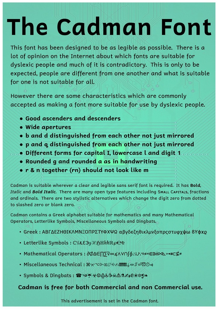
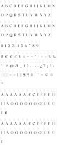
The Cadman font has been designed to be as legible as possible. There is a lot of opinion on the Internet about which fonts are suitable for dyslexic people and much of it is contradictory. This is only to be expected, people are different from one another and what is suitable for one is not suitable for all.
However there are some characteristics which are commonly accepted as making a font more suitable for use by dyslexic people.
– Good ascenders and descenders
– Wide apertures
– b and d distinguished from each other not just mirrored
– p and q distinguished from each other not just mirrored
– Different forms for capital I, lowercase l and digit 1
– Rounded g and rounded a as in handwriting
– r & n together (rn) should not look like m
– The f character has a descender to make it more unlike a turned t
– M and W should be distinguished from each other and not just be mirrored
– 6 and 9 distinguished from each other not just rotated
– The use of distinct letterforms where confusion could arise
– A slightly looser spacing than normal
Cadman fulfills all these criteria. But Cadman is not just for people with dislexia.
Cadman is suitable wherever a clear and legible sans serif font is required. It has Bold, Italic and Bold Italic.
There are many open type features including SMALL CAPITALS, fractions and ordinals. There are two stylistic alternatives which change the digit zero from dotted to slashed zero or blank zero.
Cadman contains a Greek alphabet suitable for mathematics and many Mathematical Operators, Letterlike Symbols, Miscellaneous Symbols and Dingbats.
Enjoy !