About It started with a need…
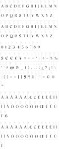
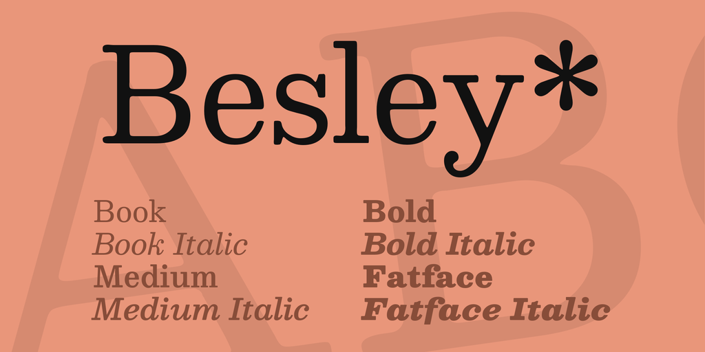
Besley* started with a need for a good, versatile, and affordable antique slab serif font. One with italics and a bold that actually was bold. One that would look good on screen and in print. An antique slab serif that didn?t have weird and gimmicky irregularities. A font that is at once welcoming and approachable, while remaining trustworthy and sturdy. Something timeless, that feels of-the-time. A font that is immediately familiar, while providing subtle surprises. A font that just functions, without having to work hard. The font I was looking for was Besley*.
The Design Process
Robert Besley?s Clarendon
Besley* is an antique slab serif, meaning it features larger, sturdier serifs, while retaining a traditional stroke width variance. Besley* is named after Robert Besley, creator of Clarendon. Clarendon is in many ways the defining antique slab serif, and its popularity is easy to understand. Clarendon?s letterforms are big, bold, and loud. Clarendon is recognizable on WANTED posters and US National Park signage.
Limitations of a Century + Old Design
Clarendon is also over 100 years old, and limited in its design and capabilities. Its wide and bold letterforms are compelling at large sizes, but impossible to read easily at text sizes. It was designed for use on metal type, which results in compromise letter forms, like its flattened f and inelegant kerning. Clarendon was never designed with a complementary italic, and retroactive attempts have all fallen short. Digitization of metal type also compromise design integrity by forcing digitizers to make aesthetic decisions, such as the rounding of corners.
Creating a Modern Classic
The design process of Besley* started with looking at what works with Clarendon and maintaining those assets, while expanding design and functionality. In order to maintain a sturdy and heavy weighting, while adding text-size readability, wide capitals are used alongside appropriately widthed lowercase letters. To make Besley* render well on screens, a larger x-height was chosen. The medium weight of Besley* is bolder than typical fonts of the digital era, to give that cowboy era weight. Italics were built into the design process, so they feel like part of the family, instead of an after-thought.