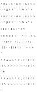
About The name of typography, emerges as a tribute to the river Arnoia, which discure at the foot of the ancient Castle Alfonso X the Wise where the “Cantigas” were compiled,
The Arno typography so named after the river that runs through Florence.
The proposal typography optical size ranges arises from the need of reinvention a highly competitive world of typography, where it is estimated that there are approximately 100,000 different fonts,
Since the sixteenth century by each type of metal subtle adjustments were made in proportions, weight, contrast and spacing, according to the end use print size so that it was equally readable.
With the advent of photographic technology and digital type, most manufacturers rate abandoned the design of optical teachers – opting instead for a “one size fits all” wherein a single optical scale size mechanically selected point size. Unfortunately, such typefaces have a limited range in which they can be perceive properly.
The goal of the optical design is to maintain the integrity and readability of the underlying design the source in a range of point sizes.
Generally made adjustments to the design to optimize for different sizes: sizes more large, the space between characters (letters adjustment) narrows the space within characters (Counterblocks) is closed (ie, slightly condense letters), serifs become contrast finer and race becomes larger, the total weight becomes lighter, and the height of x gradually decreases; small point sizes, opposite adjustments.Therefore adopt remedial typography various sizes optical reading becomes more fluid, it allows a reading without tiredness thus promoting the pernamencia in the pages of the magazine both digital and printed.


