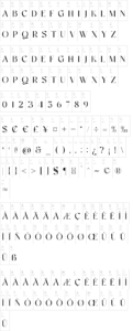
About This display font, similar in concept to Huxley Vertical but much, much beefier, is based on lettering from a poster for Italo Oil, designed in 1993 by George Guillermaz. The name was chosen to highlight some of the font?s more interesting characteristics, and is based on the assumption that, if there?s an Aerosmith, there must be an ?