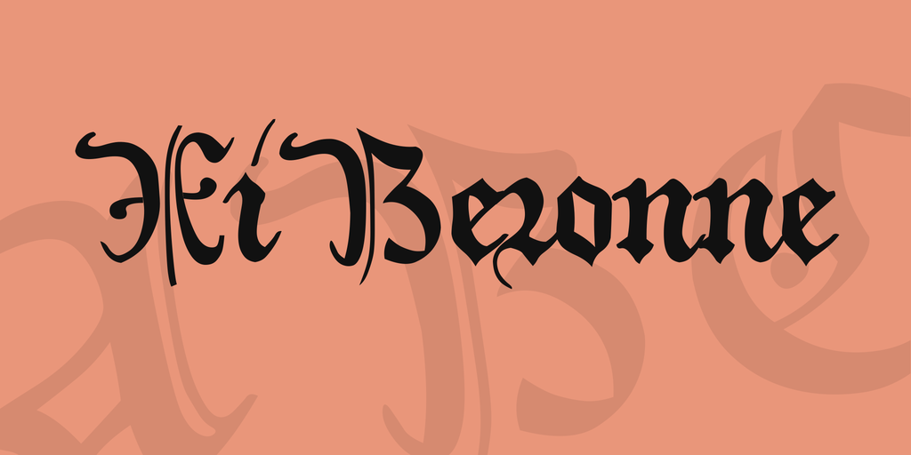
About XiBeronne is, of course, plain Black Letter — at least as far as the lower case glyphs are concerned. They were inspired by a very beautiful and very celebrated French manuscript written at the beginning of the 15th century, containing — and splendidly illustrating — Gaston Phoebus’ Book of the Hunt. Illustrations of that manuscript were displayed on the Net by the Biblioth que Nationale de France, some years ago (sorry to say, they are gone by now); and I was charmed by those lovely images into trying my hand at the tiny bits of writing that appeared in most of them. However, there were very few upper case letters, and those few were rather plain ones. Therefore, I took a genuine A from another source and shaped the rest of my upper case alphabet to match it (more or less, according to my skills).
Just a bit of information: Gaston Phoebus, Count of Foix (Foix is a pretty town on the French side of the Pyrenees), was a Gascon nobleman, living from 1331 up to 1391. He went occasionally to fight in Prussia, intent on avoiding to take sides in the war raging between French and Englishmen in southern France (or Aquitania, as it was called then), throughout the 14th century. History doesn’t portray him as a pleasant character. His Book of the Hunt, however, written during the last years of his life, didn’t rest confined to that expensive manuscript. Among the earliest works to be published in print, it turned into a bestseller at once, and continued as such, all over Europe, for centuries to come. He was the most famous authority on his subject, and his instructions were followed so eagerly that by the 19th century, France had been literally emptied of deer. I sincerely hope this piece of news won’t keep you from enjoying my font (after all, the illiterate poachers may have had a hand in the disaster, mayn’t they?).
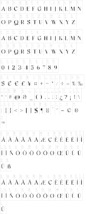
As usual, you’ll find a long s on the number sign.
– There is an ending f on the left bracket…
– …and an ending t on the right bracket
– The left curly bracket contains a double l
– On the right curly bracket you’ll find a little hook to be employed before the first letter of words – beginning with i, j, m, n, p, r, u, v, w, and z
– The bar sign contains an alternate r.
– Finally, on the ASCII tilde you’ll find a contemporary abbreviation sign of indefinite meaning, to be employed as a decoration wherever you see fit to place one. It’s to be – handled like an accent (the char won’t move when you type it).
Update 2007 has reduced the file size, by redesigning the composite glyphs, and corrected some minor flaws.
Update 2010 has redesigned all of the composite glyphs (correcting the dcaron, Lcaron/lcaron, and tcaron), and enlarged the dashes.
Buy a commercial license