Hello mighty Dribbblers!
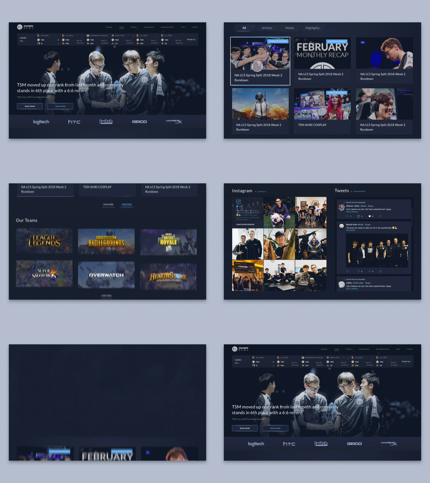
I’ve brought good news! Another website we’ve designed here at Zajno has gone live!Check out the live version here.We designed this website for cool guys from Team SoloMid, an esports team that ranks 26th in the world rating. Cybersport is getting more and more popular, attracting crowds of fans, and Zajno Crew is no exception. That’s why we were happy to take this project. We finished the design part a couple of months ago, and the website has been under development ever since. And now it’s finally live!Goals We were tasked to redesign the team’s website making it more informative and improving the style a bit, so that the fans could easily find all the info they are interested in and the website looked modern and matched the gaming world nature.Approach Since our key objective was improving the website’s information architecture and making it user-friendly for the target audience which mainly consists of the team’s fans, we decided to display the most interesting for fans info on the homepage. Therefore, at the top of the page you can see a widget that shows all the upcoming events and games. The most important current news serves as the page’s background. Scrolling down, users will see the news, articles and video streams, and they’ll also have the option to sort all the info by games. In terms of style, we kept within the dark color palette and tried to discover a design approach that would match the eSports aesthetics the best.Results That’s a wrap. What you see above is basically what we ended up with. You can check out the live version of it – as well as the rest of the pages – here. One last thing, it was a pleasure for us to work on this project. We thank everybody who worked on this and hope the website will serve well. Cheers!We’re, as always, interested in your feedback – do drop us a line!P.S. Many thanks to @Kostia Varhatiuk for his cool designs!Press “L” to show some love!ᗈ Website ᗈ TheGrid ᗈ Spotify ᗈ Twitter ᗈ Medium ᗈ Facebook ᗈ Instagram

