Hey guys!
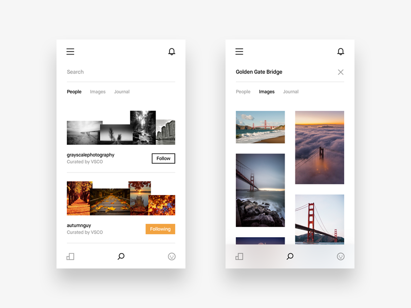
Today I am showing you the search UI of the VSCO app redesign that I’m working on. I’m really digging the way VSCO designed their search UI, which is surprisingly the only thing in my opinion they’ve done well in their current app. So I’m keeping the general look of it, but adding some tweaks and little changes to it.
I have changed the typography and paddings, so now it looks more balanced. Also changed the follow link to a nice square styled button. Additional things that you may have seen from my latest shot are the notifications (at the top) and a better navigation through the VSCO Social app (at the bottom).
Another thing I changed for the search was the grid. I absolutely hate the way VSCO executed their design language in terms of grid and paddings. I know they are trying to be different and artsy with their app, but it’s not as user friendly as it was before. My way of displaying the grid of photos is better because you get to see more content, which is the cornerstone of this app.
I’m not too sure about the Loading state that I have attached to this shot, so I am asking you if it’s alright to use the three jumping dots for a loading animation? It’s basically the same tha Google uses. I really like it, but I’m not sure if it’s appropriate to use here. I simply don’t like spinning wheels 😁
That’s it! Hope you’ll like this and stay tuned for new updates 👊
Follow me on Twitter
Follow me on Instagram

