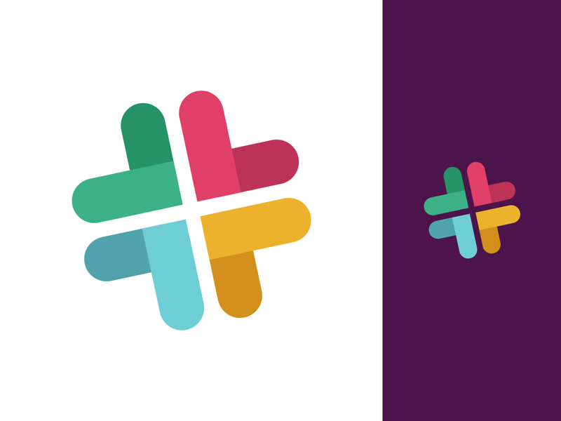
This Slack logo redesign was exclusively made for the Up Slack Re-branding Challenge.
Check it out on my Dribbble page:https://dribbble.com/shots/5905994-Slack-New-Logo-Rebranding-take-3
The instance I saw the new Slack logo, it felt a bit awkward about it. The guys at Slack said that their former logo is impractical – they even went so far as using the word “awful”, but I personally always found it original, interesting and actually very well balanced color-wise. And it was a fun and dynamic logo with it’s odd angle, always feeling it’s about to trip on its side.
I think Slack and Pentagram went too far away from the old logo and ditched all the fun to a boring looking and mostly fragmented form, standing still at a 90 degrees angle and made of 8 separate shapes that don’t really interact with each other. To add injury to an insult they went for a color palette which calling it “awkward” would be an understatement. And man – as much as I try, to be honest, I see no speech bubbles over there, just rubber duckies! And I know I’m not alone in this.
What I tried to do here is some reverse engineering regarding the colors to show my love to the original unsaturated shades, and also put back the fragments together to a more cohesive form. I then tilted it by 12 degrees trying to bring some of its original mischievousness.
And I know it was very important for the Slack team – so I tried to make it work well both on a white and on a dark background.
What do you guys think?

