About The basic difference between a type designer and a graphic designer is simply this: the type guy will always worry about the type itself without giving consideration to how flexible the type will be in the graphic guy’s hands. Ever since the established digital type technologies we have nowadays came into their proper places, this difference has been and is now still being debated back and fourth. Some type designers stick to their guns and say that it is the graphic designer’s job to make the most out of the type, but this theory tends to forget that no matter how deep-rooted the art element in type happens to be, type was, is and will always be just an accessory to graphic design, except of course in very exclusive circles where type is everything and its usage is not an issue. Other type designers, on the other hand, have come to the realization that their work will receive its only valuable recognition by the people who use it, i.e. graphic designers of all levels. The most common way that shell-shocked typographers meet the graphic designer’s need for flexibility has for a while now been simply to make different weights and variations of the same font. Font families of course get more recognition and/or money than a single font. But still, although the flexibility issues receive a partial solution through the “font family” method, it is still nowhere near perfect, and graphic designers are incessably asking for more variations on every theme. For a minor example, where is Gill Sans Light Condensed when you need it? Nowhere to be found, because it was never made. One would think that in this age of information, everything would be available for the person who wants to do not much more than lay out information.
Multiple masters are another way of trying to meet the need for type flexibility. The approach is basically putting many more possibilities in the graphic designer’s hands than a 12-font family or even a 200-font family can provide. Most multiple masters have a minimum of 1000 possibilities for a typeface. These possibilities of course vary by design, being concerned with width or weight or overall shape, or all of the above. This technology constitutes a near perfection in flexibility for the graphic designer. But now it’s supposedly not supported by its makers anymore (Adobe), and so this solution is scrapped, and we once again see the wall rise up between graphic designer and type designer, both of whom are caught in a flood of people who are homing in on their respective trades, with more pressure being again placed on type designers to meet the graphic designer’s demands, now with ever-increasing risks of the type produced not even meeting its initial cost of time and material.
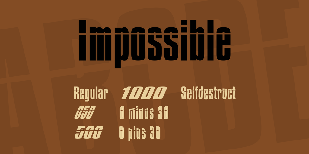
Not at this lab, though. Multiple masters will still be produced here for as long as they can be used by applications. The MM accompanying this note is another proof of that. ImpossibleMM is a three-axis multiple master, with one axis for width, one for slant, and one for character disintegration. Make sure to also download the true type zip, because it contains a couple “angled” fonts that cannot be produced from the multiple master. I wanted to add a fourth axis to the multiple master, that enables 3D “angling” from -30 to +30 degrees, but I found out the hard way that ATM has never supported 4-axis multiple masters. So 3 is it.
Hope you like it, and use it in good health.
? Apostrophe (‘). Distribute freely. [email protected]

