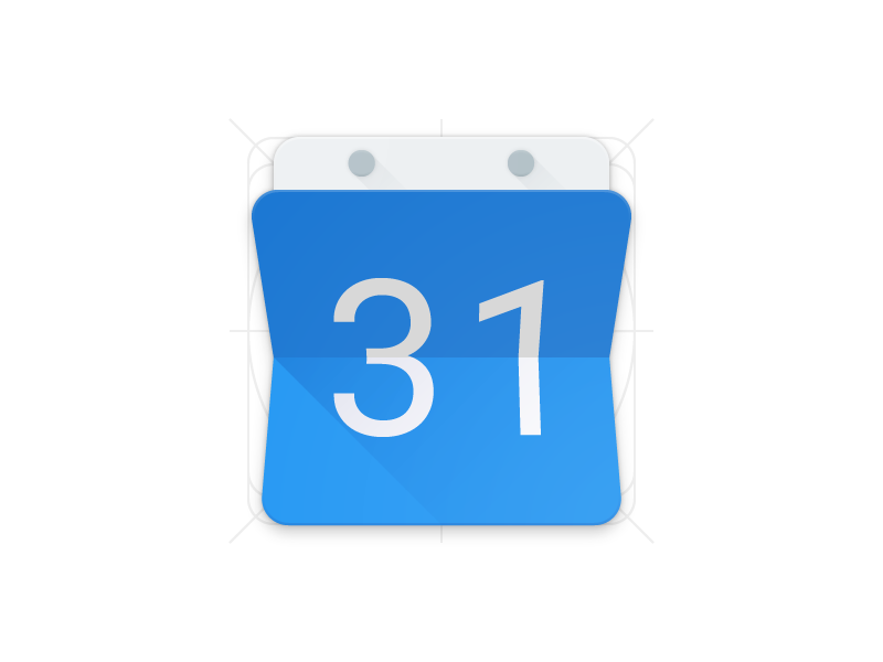
This is a personal remake of the Google Calendar Icon.
The shape of this icon seems slimmer compared the original icon. Yet, they’re both the same width. The bottom portion of my icon folds at a lesser angle than the top portion, thus creating the illusion that this icon is slimmer.
The coloring didn’t make sense to me. I love Google’s version of blue, but it seemed to serious. That certain shade of blue should be used in contained areas (I believe). Instead, I opted for a softer shade of blue that represents a welcoming calendar. Along with that, the color of bottom layer and dots got a makeover. I saw the bottom layer as paper and the dots as nails. it is a calendar (presumably hanging on a wall) after all. White paper and gray nails just made sense.
Finally, the number. I changed the font Roboto Mono to give it a more informative feel. Then I gave it a nice fold.
This was a complicated icon, but a great one to make for practice.
Hope you guys like it 🙂