About Version 2.0: see below for explanation and new alterations.
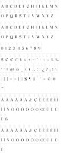
Dihjauti /di:.’hjau.ti: | dee.’hyow.tee/, is predominantly based off Dwiggin’s Electra with shades of Baskerville, Fairfield, and Perpetua. It is modern and stately, and like its inspirers, it has broad counters and spacing, which temper it and give it warmth, making it comfortable and well-suited for longer texts. It is balanced in all aspects, from its punctuation to its reference marks and symbols. Its design takes into consideration all extra characters for languages that few fonts support, such as African and First Nation. These extra characters, such as Edh, Esh, Gamma, Ezh, Yogh, the pharyngeal fricatives, the click consonants (which have added capital versions), the glottal stops, et cetera, actually look like they belong, as opposed to being afterthoughts. The italic incorporates a touch of Arrighi. It includes all transcription systems relevant to the Latin, Cyrillic, and Greek alphabets, as well as standard Coptic, plus extra characters for Teuthonista and First Nation. It also includes, to list a few, Egyptian-styled pictographs (where applicable), APL, a plethora of mathematical symbols and arrows, and a number of alternatives in the PUA.
This is the updated and redrawn version of Dehuti/Dehjuti. After using the font on my kindle, I slowly began adjusting its design, spacing, and kerning, making it even more like Electra, but now with hints of Baskerville, as I realized that I wanted it to be more rounded. The italics, as a result, and which I had always had issues with design-wise, thus became Scotch-styled. Dihjauti S (Scotch) reflects that influence in the capital Q. This version (2.0) has some spacing fixes and redesigns to certain characters, those most notably being the asterisk and question marks, the italic a, e, and k, the combining hook and horn, all glyphs with flares, i.e., all combining glyphs (such as the macrons), , E, F, f, g, t, et cetera, and the middle strokes/serifs of a, c, e, s, et cetera, which have become more Electra-esque. The Scotch-styled Q has been redesigned. Also, new characters have been added (SIL additions), while others have been moved.
Since Dihjauti is a Unicode font, I will update it on occasion, so check back for newer versions.
Notes: 1) The superscript characters, modifier letters, and the numerators, are all part of the superscript table. 2) The bold versions of the font have some alternative/reversed characters; I did this because there is no difference in the math or punctuation symbols, i.e., the bold versions are not actually bold (with exceptions), which gives the font a better harmony. 3) The font uses anchors, which means that it will not align properly for linguistic use, or otherwise, without opentype. 4) For those interested, Open or Libre Office can access all glyphs using: Insert > Special Character.