Hey buddies!
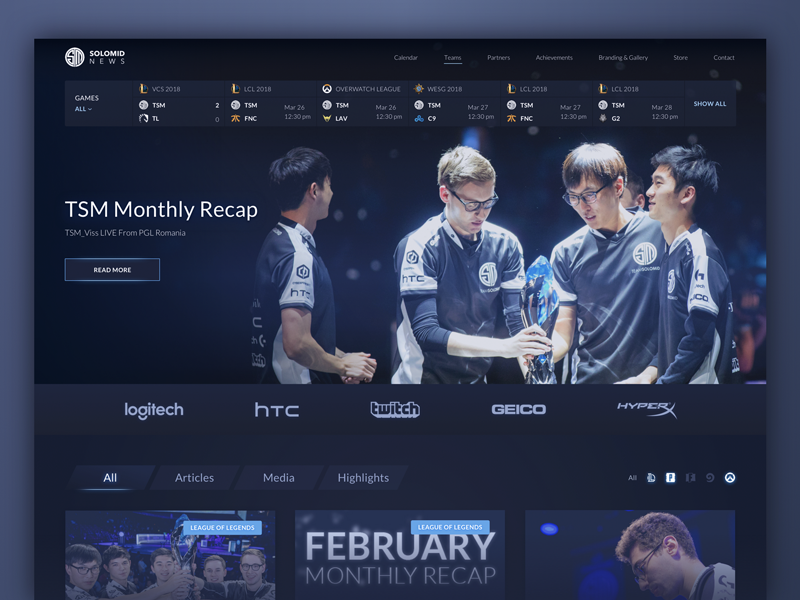
Nowadays, cybersport is getting more and more popular, attracting crowds of fans. Zajno Crew is no exception, personally I’m really interested in the topic. That’s why we were happy to design a website for Team SoloMid, an eSports team that ranks 26th in the world rating. We’ve already finished the design part, and while the website is under development, we decided to share its homepage with you here to give you a sneak peek at what we’ve been working on recently.Goals We were tasked to redesign the team’s website making it more informative and improving the style a bit, so that the fans could easily find all the info they are interested in and the website looked modern and matched the gaming world nature. You can check out the current version of the website here. Stay tuned not to miss the release of the new one! ;)Approach Since our key objective was improving the website’s information architecture and making it user-friendly for the target audience which mainly consists of the team’s fans, we decided to display the most interesting for fans info on the homepage. Therefore, at the top of the page you can see a widget that shows all the upcoming events and games. The most important current news serves as the page’s background. Scrolling down, users will see the news, articles and video streams, and they’ll also have the option to sort all the info by games. In terms of style, we kept within the dark color palette and tried to discover a design approach that would match the eSports aesthetics the best.Results What you see above is just a glimpse at what we ended up with. But there’s more, we’ll share it as soon as the website goes live which won’t take long. Keep in touch and stay tuned to see the entire thing! And share your feedback, we really love it when you drop us a line!BTW, are you a gamer yourself? What are your favorite games?Don’t forget to follow Zajno on social media and feel free to drop us a line: Facebook | UpLabs | Twitter | Instagram | Zajno | Medium

