
Design chaos starts small, with an extra shade of gray here and a misaligned button there. But soon, your clean interface becomes a mess of inconsistent components and confused developers. Sound familiar?
This blog isn’t about theory. It’s about showing you exactly how to create a design system in Figma, one that your whole team can actually use. No matter if you’re freelancing or working at a UI UX design agency, a strong system means fewer mistakes, faster decisions, and better handoffs.
Figma gives you the structure. But it’s your process that builds the system. And in this guide, you’ll learn how to set it up from scratch, with purpose, not guesswork.
How to Create a Design System in Figma
Creating a design system might sound overwhelming, but in Figma, it’s more doable than you think. With the right approach, you can build a system that brings clarity, speed, and consistency to your entire product team.
Below are the right steps to help you build a well-structured design system from scratch, without the mess.
Step 1: Define Your Goals
Before jumping into Figma, take a step back and ask yourself: What do you want this system to achieve? A design system isn’t just a nice collection of components, it’s a solution to specific problems.
Also, identify your audience first. Is this system for product teams? Developers? The marketing crew? Or all of them?
From inconsistent UIs to poor developer handoffs, a well-built design system can fix a lot of friction points. But only if it has a defined scope. Don’t try to design everything at once.
Focus on the elements that get reused the most, like buttons, inputs, and colors. Keep it lean, purposeful, and easy to scale.
Step 2: Set Up Your Figma Workspace
Cluttered files slow everyone down. Start by creating a clear file structure in your Figma workspace. At the very least, have separate files for:
1. Components
2. Style foundations
3. Documentation
Enable team libraries so your team can access and reuse assets across projects. Also, establish naming conventions and file organization early.
For example, use folders like “UI Components,” “Icons,” and “Typography” rather than dumping everything in one place. This small habit creates a big payoff later.
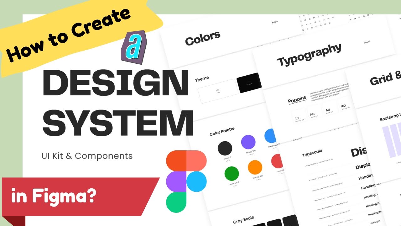
Step 3: Create the Style Foundations
A good design system starts with solid foundations. Always begin with colors, define your primary, secondary, and neutral palettes. Add semantic colors too (for things like success, error, and warning).
Next, build your typography scale. Choose font families, define headings, paragraph styles, and font weights. Then create spacing and grid rules, decide on a base spacing unit (like 8px), set up layout grids, and apply consistent padding.
Don’t forget icons. Use a consistent style, size, and stroke weight across your icon set. Save all these as Figma Styles, so they can be reused, edited globally, and easily applied across components.
Step 4: Build Core Components
Now it’s time to create the reusable building blocks. Start with the most-used elements: buttons, input fields, cards, avatars, and badges. Each component should be flexible, modular, and easy to maintain.
Use Variants in Figma to manage different states of a component (e.g., default, hover, active, disabled). This reduces clutter and improves usability. Stick to a clean naming structure like Button / Primary / Hover.
It helps when searching or inspecting later. However, remember to keep your components atomic like small, reusable pieces that can be combined to create larger patterns.
Step 5: Use Auto Layout & Constraints
To build a responsive and efficient system, every component should use Auto Layout and constraints. Auto Layout helps align, space, and size elements dynamically. For example, a button label should adjust padding when the text changes.
Use constraints to control how components behave when resized. It’s essential for components to adapt to different screen sizes and maintain their structure in real-world usage. These two features are the backbone of any scalable design system.
Step 6: Document Usage Guidelines
A design system without documentation is just a fancy library. Add clear instructions for how and when to use each component. Include do’s and don’ts, color contrast rules, spacing tips, and example use cases.
This doesn’t need to be overwhelming. Create a dedicated page or frame inside your Figma file with written notes, arrows, and labels. This approach makes adoption easier and cuts down on Slack questions from confused teammates.
Step 7: Enable & Share the Library
Once your system is ready, publish it as a shared library. It lets every team member pull components and styles directly into their designs. Encourage your team to use the assets from the library, not copy/paste from old files.
Keep track of changes through version control. If you’re making updates, notify your team. A changelog inside the Figma file can be helpful.
Step 8: Collaborate with Developers
Bring in developers early, don’t wait until handoff. Use Figma’s Inspect Panel and Dev Mode to give them all the specs they need. Make sure your naming and structure align with the codebase.
If possible, link components to frameworks or design tokens. Collaboration isn’t a final step, it’s baked into the process.
Step 9: Maintain and Iterate
A design system isn’t a one-time task. Schedule regular reviews, monthly or quarterly, to remove unused elements, refine patterns, and add what’s missing. Gather feedback from real usage: what’s working, what’s not, and where confusion still exists.
Design systems grow with your product. Treat it like a living product, not a finished file.
Common Mistakes to Avoid While Creating a Design System in Figma
Even the best design systems can fail if they’re built without intention. Here are some frequent challenges that can slow your team down instead of speeding things up:
1. Overcomplicating components: Too many nested layers or overly flexible components can make usage confusing. Keep it simple and practical.
2. Skipping documentation: A design system without usage guidelines is just a styled file. Make sure designers and developers know how and when to use each asset.
3. Not getting team buy-in: Build your system with the team, not for the team. Early collaboration ensures adoption.
4. Ignoring mobile and accessibility: If your components don’t scale across devices or meet basic accessibility standards, they’ll be reworked, again and again.
Avoid these, and your system will truly serve its purpose.
End Note
A solid design system isn’t just a nice-to-have; it’s a time-saving, stress-cutting asset for every team. Whether you’re a solo freelancer or part of a fast-moving UI UX design agency, knowing how to create a design system in Figma sets you up for consistency, clarity, and collaboration.
Don’t wait for design chaos to creep in; build your foundation now. Keep evolving, keep refining, and let your design system grow with your product and team. Your future self (and devs) will thank you.


