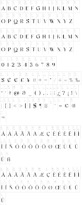
About Based on French Bastarda writing and some — freely handled — Rotunda capitals, this font has no match in historic documents. It’s a first try to combine imitation and imagination.
Just in case the term Rotunda is news to you: this means the style of formal writing used in Italy during those centuries when the rest of Europe was writing Black Letter. They never took to acute angles and steep curves in Italy, neither in architecture — where they directly moved on from the Romanic style to the Renaissance, leaving the French gothic to the barbarous north — nor in writing; developing and preferring a style that was clear, and straight, and rounded, and by far better legible than the crammed and distorted Black Letter weaving. It seems however legitimate to tamper with Rotunda capitals, for the original scribes were pretty often given to do it themselves. Lower case letters don’t hold much potential for variation, so they took their revenge on the upper case. Invention is mightily at work there, and some writers seem to have deemed it artistic bankruptcy to employ the same shape of an upper case letter twice on the same page, or even in the same chapter. All of which is to say that I didn’t go far out of their way by creating some Rotunda capitals of my own.
The name ‘Xenippa’ is Ancient Greek and means ‘having strange (= not one’s own) horses’.
Update 2007 has reduced the file size, by redesigning the composite glyps, has added an s that sits on the line, as well as a Yen sign, has corrected the Ldot/ldot, and has moved some of the special characters. These are now
– an et ligature on the left curly bracket
– an st ligature on the right curly bracket
– the new alternate s on the bar and broken bar sign
– a double long s on the long s sign
– a long s+t ligature on the ‘not equal’ sign
– The alternate C and E have gone off to the masculine ordinal indicator (fi, ‘less than or equal to’ sign) and feminine ordinal indicator (fl, ‘greater than or equal to’ sign); and the alternate G can be found on the ‘divide’ sign.
The long s, however, still keeps its place on the number sign.
Update 2010 has enlarged the dashes, has the composite glyphs redesigned (especially the dcaron, Lcaron/lcaron, and tcaron), and has created a new m.
Buy a commercial license