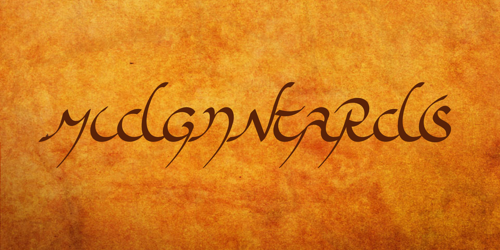
About [smallcaps]Midjungards[/smallcaps] is an amply ?ctitious Gothic hand script. Beside my interest in history, language and culture of the ancient Goths, I?m a great friend of [smallcaps]J.R.R. Tolkien[/smallcaps]?s ?uvre?and in the intersection of both now lies this font. It is modelled on the italic style of the Elven script Tengwar. The name Midjungards (goth. ?world?) follows the name of [smallcaps]Tolkien[/smallcaps]?s fantasy continent, ?Middle Earth?, which in turn is obviously derived from the Germanic ?Midgard? (as [smallcaps]Tolkien[/smallcaps]?s world borrows many a motif from European mythology and history).
This typeface contains 110 characters. To allow writing in programmes that don?t support the high Gothic Unicode range (as for example MS Word), the Gothic characters are mapped to the Latin range as well. And in order to render texts in Midjungards that distinguish between upper and lower case letters, this font?s latin majuscules and minuscules are equally mapped with Gothic glyphs. Finally, to achieve a neat sequence of letters, it is highly recommended that kerning and ligatures be turned on.
Midjungards is compatible with those of my fonts having a more extensive character set. If a text is set from Ul?las or Skeirs into Midjungards, characters not included in Midjungards???e.?g. some accents???are simply omitted (instead of being displayed as boxes).
Just as Silubr, Midjungards comes with a ?hist? feature that automatically renders a typeface that is closer to historic Gothic writing: Spaces are omitted, punctuation is reduced to mid-dot and colon, and a diaeresis is added to an ?I? at the beginning of a word (whilst in the mid of a word, at the beginning of a syllable, a diaeresis should already be set). In Order to make this feature available in Microsoft Word 2010 (which supports just a few OpenType features, including the stylistic sets), I?ve added a copy of this feature as stylistic set ?ss05?.
For a demonstration of both, see the analogous illustration at the Silubr page.
Kerning (?kern?) and ligatures (?rlig?) beautify the type face, while the stylistic sets ?ss01? and ?ss02? replace each diaeresis by the one or other kind of [smallcaps]Tolkien[/smallcaps]?s triple dots.
If you like this font or if you would like to comment on it or to make a proposal, feel free to visit my personal website at robert-pfeffer.net and to write into my guestbook!
Robert Pfeffer