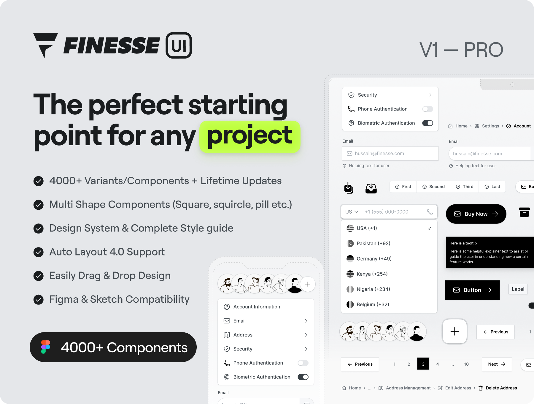
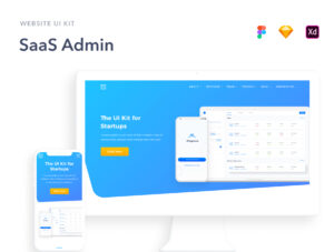
The only Figma UI kit and Design System you will need.
Finesse UI Kit has been carefully crafted to meet the needs of designers and developers alike, and is suitable for a wide range of projects and applications. Using this, you can save time and effort by starting your design process with pre-built components that can be easily customized to fit your brand and project requirements.
Looking for a Free Version with limited components. Look no further, duplicate now.
What will you get in PRO version?
1. 4000+ Variants
2. Figma & Sketch Compatibility
3. Multi Shape Components (Square, squircle, pill etc.)
4. Lifetime Updates Support
5. Auto Layout 4.0 Support
Components Overview
1. Alerts – Informative messages displayed to the user
2. Avatars – Representations of a user or object, often used for identification.
3. Buttons – Clickable elements used to trigger an action or navigate.
4. Toggles – Controls that allow the user to switch between two states.
5. Checkboxes – Controls that allow the user to select one or multiple options.
6. Radio Buttons – Controls that allow the user to select one option from a group.
7. Check Circles – Controls that allow the user to select one or multiple options.
8. Icon Buttons – Buttons containing only an icon to trigger an action on screen.
9. Segmented Controls – Allow the user to switch between different options or views.
10. Inputs – Allow the user to enter data or information.
11. Badges – Indicators used to display a count or status.
12. Tooltips – Small pop-ups that display additional information.
13. Snackbars – Brief messages displayed to the user at the bottom of the screen.
14. Pagination – Navigation elements used to move through a series of content.
15. Breadcrumbs – Navigation elements used to display the user’s current location.
16. Progress Indicators – Indicators used to display the status of an ongoing process.
17. Sliders – Controls that allow the user to adjust a value by dragging a handle.
18. Dropdowns – Allow the user to select an option from a list of choices.
↳ More Updates Coming Soon
Styles Overview
1. Typography – Text styles compatible for all responsive device sizes like Mobile, Tablet, Desktop etc.
2. Color Palette – Minimal Monochrome color palette to following accessibility standards.
3. Shadows – Built to focus on components & different states for each component like Hover, Pressed etc.
4. Icons – Our design system make use of Heroicons which is a collection of 880+ polished and beautiful hand-crafted SVG icons, by the makers of Tailwind CSS.
5. Avatar Images – Our design system uses carefully crafted avatar illustrations from Craftworks
6. Company Logos – The logos are used for illustrative purposes only, and no endorsement or affiliation with the respective companies is implied.
↳ More Updates Coming Soon
Learn more on our website www.finesse.website

